"English Studies ... still privilege[s] the Word as its preferred mode of
performance, and linear argument as its preferred form. For this to change,
more scholars must move beyond critical verbal analysis of visual texts and
become active architects of intellectually engaged (and engaging) multimediated
visual rhetoric. Until we and our students see ourselves as producers rather
than just consumers of visual rhetoric, we are ceding the authority to speak
and intervene in an increasingly mediated world" (Delagrange 11).
Before I embark on my big creation (a Wordpress site for my AP English class), I wanted to practice being a thoughtful producer of digital design who would make Susan Delagrange proud.
My mostly completed Google Site for my freshmen was a good place for me to practice. With the structure of the site already set, I could revise with visual rhetoric first and foremost in mind. What did the homepage of my sight convey through its design? What did the design choices I made on the Cooked Texts assignment mean for how this assignment would be perceived initially by my students? Did my design help them understand the assignment more than a traditional hand-out would?
"[L]inks, re-defined as associative 'lines of flight' (Deleuze and
Guattari,
1987) rather than transparent and immaterial windows between nodes of
information, transform them into connective tissue which creates the
meaning of the words and images it joins" (Delagrange 18).
1987) rather than transparent and immaterial windows between nodes of
information, transform them into connective tissue which creates the
meaning of the words and images it joins" (Delagrange 18).
While at DMAC, classmates looked at my homepage. Their feedback was pretty consistent: a great deal was going on. and they did not know where to start on the page. I have had this feedback in the back of my mind ever since because it did not make me want to change the homepage. I needed to tease out why, and reading Delagrange helped cement for me that I actually had designed the page thoughtfully.
When I got feedback in the spring from my freshmen on my first draft of the homepage, they said it was dull and asked me to add things. This is a key part of my rhetorical design -- I have my audience in mind. High school freshmen are very different from college students and professors (all of my DMAC classmates were professors or college students). And while I do not want to go into this too much here (come back later and read my dissertation!), I believe my freshmen have not yet been indoctrinated into the limited design of traditional academic texts [I quote Delagrange again: "English Studies ... still privilege[s] the Word as its preferred mode of performance, and linear argument as its preferred form" (11).] I added the background color and introductory snippets for each genre in response to my students' feedback, and they loved the site next time they saw it.
I also intentionally designed the page to not be linear -- I actually spent a ridiculous amount of time getting the genre images and words in the two columns laid out as they are (layout in Google Sites is not easy -- it privileges linear left to right reading actually now that I think about it ...). My students will use this site all year, and what I hope is they will be interested enough by the images and snippets to click on some of the genres even before we get to them -- that these will become "lines of flight" (18) for them. I also hope that as the year goes on, they will come to understand my equal layout of each genre -- no one genre is more important than another even though I have to choose to start with one first. I want the layout to be curious and nontraditional, and I know now, from the DMAC feedback, that I achieved this.
"[D]igital media work assigned to students often asks them to do little
more than produce traditional linear print, with an image or two
thrown in as mere illustration rather than as a necessary contribution
to the meaning of the text" (Delagrange 28).
more than produce traditional linear print, with an image or two
thrown in as mere illustration rather than as a necessary contribution
to the meaning of the text" (Delagrange 28).
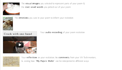
My Cooked Text pages are where I tried to model for my students how this assignment is asking them to do much more than what Delagrange sees as typical digital media work. I went crazy at first with images on the introductory page.
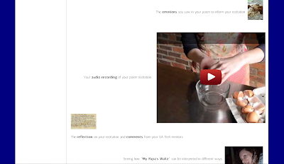
I had a picture for every point, and I had a REALLY BIG YouTube video. I wanted to include a video to have multiple modes to reinforce the point that they will be using multiple modes. I put this video next to the requirement that they have audio tracks in their video. However, Google Sites does not allow for resizing of YouTube embeds. Thus, the ridiculous layout of smaller images with a huge video.
So, I set out to break this limitation, learning from the Google users forum about gadgets, particularly a user-created gadget that allows me to resize Youtube videos. I flexed all of my HTML coding muscles to embed the given code plus figure out how to adapt the YouTube URL so it would play in my new gadget box (versus having an empty gadget box like I did the first few tries!).
After many failed tries at this, I have to be honest and say I felt only relief when I saw the smaller video -- I just was not sure I understood what I had done to make it work. So, this morning I decided to be sure I knew. I went to the requirements page of the assignment and resized the first (and less important) video. Not only did I successfully embed the gadget and adjust my YouTube URL the very first time, I also resized the video itself so I did not need scroll bars to see it all in the smaller box. Now I feel like an accomplished coder.
I also feel that my introduction and requirements pages for this assignment are designed to better show my students just what this assignment is about than a traditional hand-out would. (I also cut down on the number of images I included, pairing requirements with an image so the number of images was not overwhelming.) They have to explore the pages to find out everything involved, they have multiple multimodal examples to inspire them, and the assignment pages themselves are multimodal. I am doing what I am asking them to do, something that has always been a goal of mine as a teacher.
References
Delagrange, Susan. Technologies of Wonder: Rhetorical Practices in a Digital World. November 2011. June 23, 2012 .


I love that this reflection is bouncing back and forth between "why am I doing this?" and "how the #$@! do I do this?" I also appreciate that you are very much reminded by the "you learn it when you need it" model and pleasantly surprised by how much "sticks" when you learn it that way. Really says a lot about the various "higher levels of Bloom's taxonomy" and learning. I do love the cover page to your Google Site; I think you have done a beautiful job of addressing your students' concerns.
ReplyDelete