Alignment
Nothing should be placed on the page arbitrarily.
Every item should have visual connection with something else on the page (33).I am a center-alignment user. I admit it, and well, I can't deny it anyway because all you have to do is look at the post right below this one to see my center-alignment in action. But that is about to change!
"A centered alignment often appears a bit weak. If text is aligned, instead, on the left or the right, the invisible line that connects the text is much stronger because it has a hard vertical edge to follow" (35). Before I could even apply alignment to my class site, my blog was in need of some serious help. Ironically, my "Designing for 'Wunder'" post had the worst offenses with center-alignment.
 |
| Original Post |
 |
| Revised Post |
And while I am now itching to fix all of my posts, I need to focus on my class site. If you have been following along with my design practice, you might remember that in my proximity play, I chose center-alignment for my course's essential questions. When Williams wrote, "A centered alignment often appears a bit weak. If text is aligned, instead, on the left or the right, the invisible line that connects the text is much stronger because it has a hard vertical edge to follow" (35), I had to pause. What this meant is that I had put my most important text into the weakest alignment. However, Williams also recognizes that rule-breaking is okay too. In fact, I felt like I had read her mind when I wrote about rule-breaking in my proximity post because I had talked about how I needed to know the rules before pushing back against them. Williams wrote, "Robin's Rule about Breaking Rules: You must know what the rule is before you can break it" (49). Maybe she and SusanDelagrange are more on the same page than we might think.
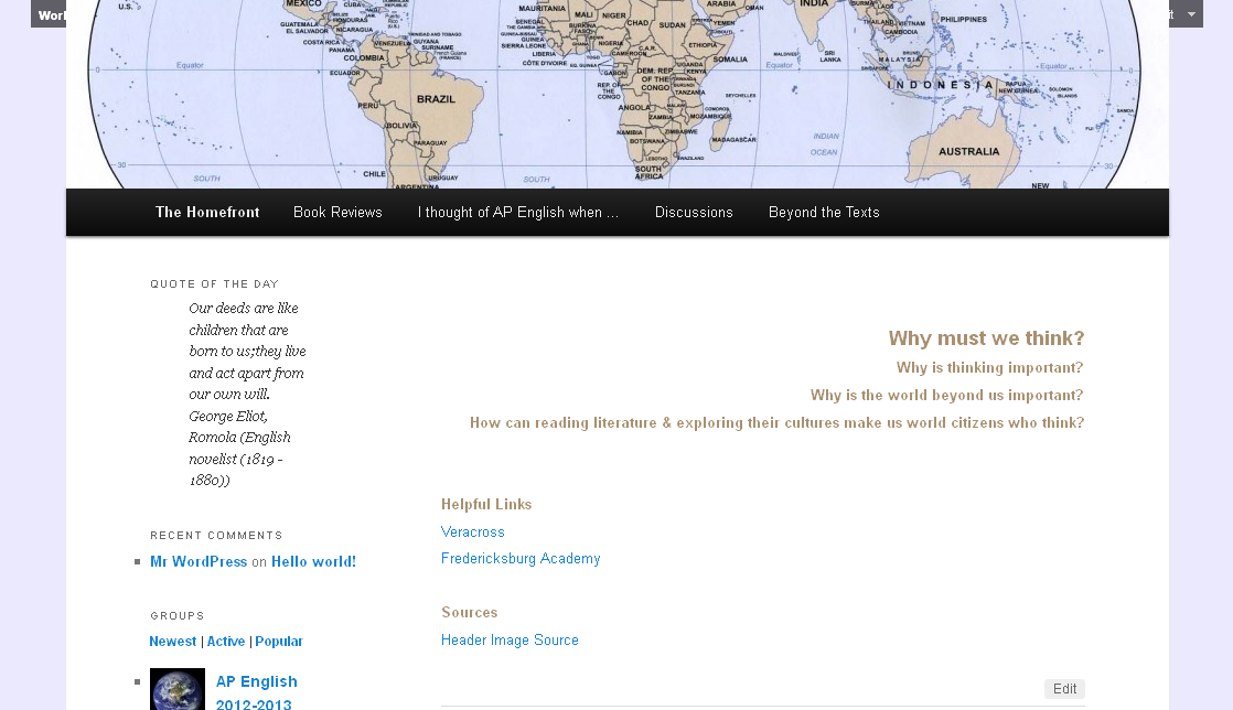
 |
| My Original Homepage |
 |
| My Right-Aligned Homepage |
 |
| My Revised Questions |
I do not want to accept traditional alignment design blindly though, just as I wanted to push back against proximity, so I want to end by thinking about Williams's reasons for alignment: "Lack of alignment is probably the biggest cause of unpleasant-looking documents. Our eyes like to see order; it creates a calm, secure feeling. Plus it helps to communicate the information" (43). When I look at my three different homepage images, I definitely think the final one is more "[pleasant]-looking." However, I do not necessarily think the final design is "calm[er]" or more "secure." In fact, I think left-aligning the questions would do that ["Until you have more training, stick to the guideline of using one text alignment on the page ..." (40).], but this would also make the questions less prominent than I want them to be. So, bending the rules works for me here, but I am still not breaking the rules because I am not combining center- and right-/left-aligned. I feel right now that I can play with proximity more than alignment - that is, the traditional rules of alignment are pretty effective. Maybe this is because there are less options with alignment - left, right, center are pretty much your choices. I wonder as I play more with design, with the next element being repetition, if I will continue to feel this way and if any of the upcoming principles will be ones I feel I can play with more.
References
Williams, Robin. The Non-Designer's Design Book: Design and Typographic Principles for the Visual Novice. Third ed. Berkeley, CA: Peachpit Press, 2008. Print.
No comments:
Post a Comment